A live digital twin of your terminal
Every navigation session generates a stream of anonymised position and behaviour data. GlidePath Air Insights aggregates that stream into actionable operations intelligence — passenger flow, dwell patterns, queue build-up, and more — without adding a single sensor.
Decisions that used to require a consultant
Passenger flow data has historically come from expensive camera-based counting systems or manual observation. GlidePath Air makes it a by-product of the navigation service.
Live Passenger Flow
See how many passengers are in each zone of your terminal right now. Identify bottlenecks before they become delays.
Dwell Heatmaps
Which zones are passengers spending time in? Which are they rushing through? Dwell data informs commercial placement and staff deployment decisions.
Peak-Hour Forecasting
Historical session data builds a model of your terminal's busy periods — enabling proactive gate staffing and cleaning schedule optimisation.
BI Streaming
A built-in Power BI streaming push (env-activated) sends live session metrics to a Power BI streaming dataset in real time — no proprietary dashboard required. Tableau, Grafana, and generic webhook connectors are on the roadmap.
Nine views. One platform.
The GlidePath Air Insights dashboard is built for airport operations managers, commercial directors, and IT teams. Each card below is tagged with an honest implementation status: Live = working as described, v1 = real but limited, Roadmap = not yet built.
Live Live
Snapshot of active navigation sessions with anonymised positions, refreshed every few seconds. Shows session counts and active destinations on the floor plan.
Traffic v1
Top corridors and zones by visit count and dwell over selectable windows. Historical-day-of-week comparison is not yet built.
Timeseries v1
Distinct-session counts per time bucket and hour-of-day distribution. Route-completion tracking and free drill-down by week are on the roadmap.
Operational v1
Blocked-edge event log, dead-zone detection, and PRM session presence in the live view. Gate-utilisation and estimated security-queue depth are on the roadmap.
Quality v1
Session duration histograms, position-sample density, and basic completion counts. Per-edge reroute frequency and explicit accuracy metrics are on the roadmap.
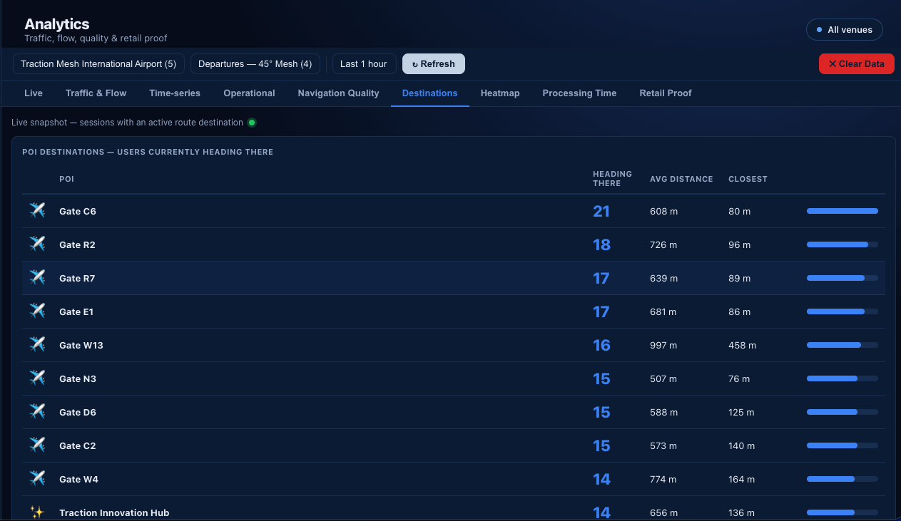
Destinations v1
Live snapshot of which gates, shops, and POIs active sessions are heading to. Historical ranking over arbitrary time windows is on the roadmap.
Heatmap Live
10 m grid of passenger position density, rendered on a canvas over your floor plan. Aggregates from historical position logs.
Processing Time v1
Session-duration percentiles (P50 / P90) and hourly / daily trend, aligned to the ACI <30 min target. Per-zone benchmarks (security vs. passport control vs. gates) and queue-build-up flagging are on the roadmap.
Retail Proof Live
Per-shop funnel — offered, accepted, arrived at shop, returned to gate — derived from safe-excursion sessions. No extra counting hardware.
What Insights delivers today
Honest list. Built means working in the current code; Roadmap items are designed but not implemented yet.